Milla

From Latin research all the way to wood carving, Milla is all for the bees!
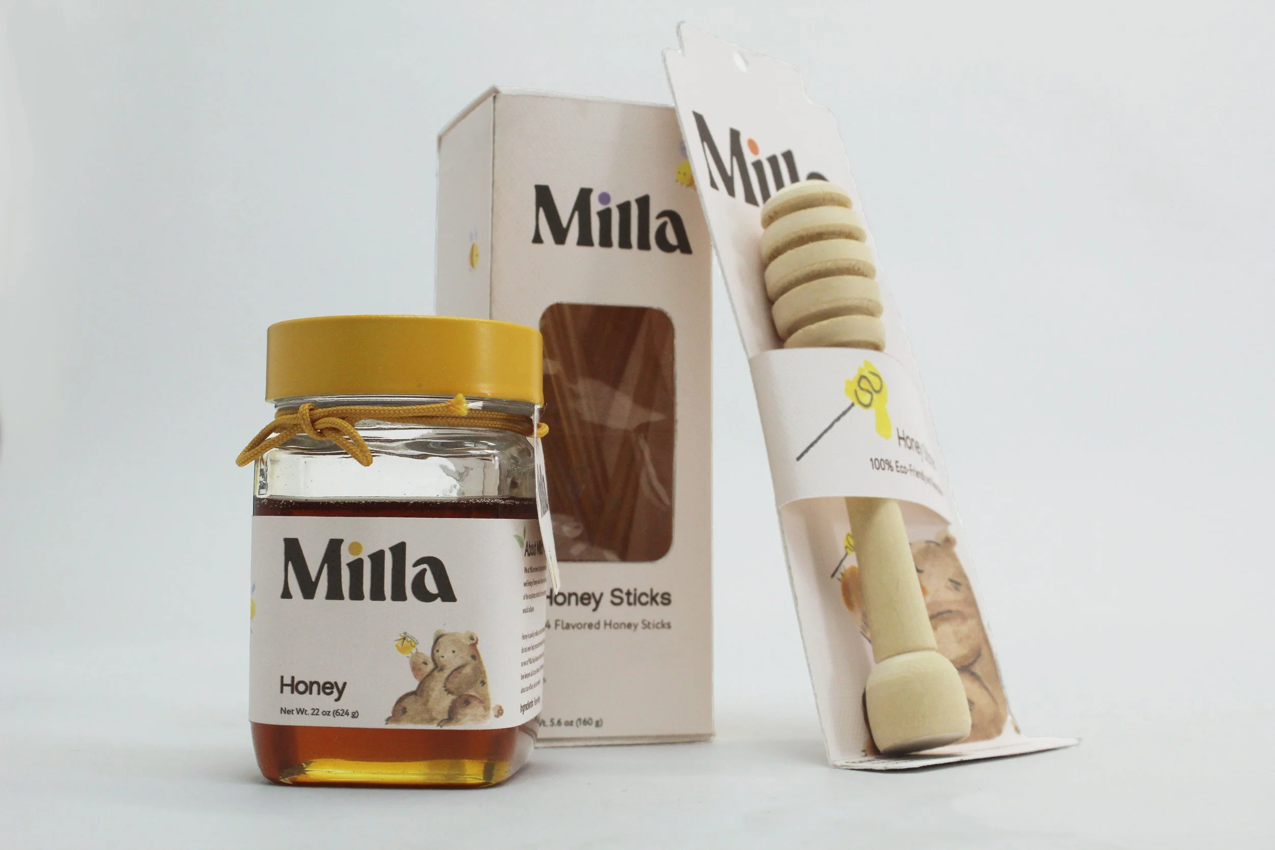
  • Design a suite that creates a suite of three items that can live in a branding system.

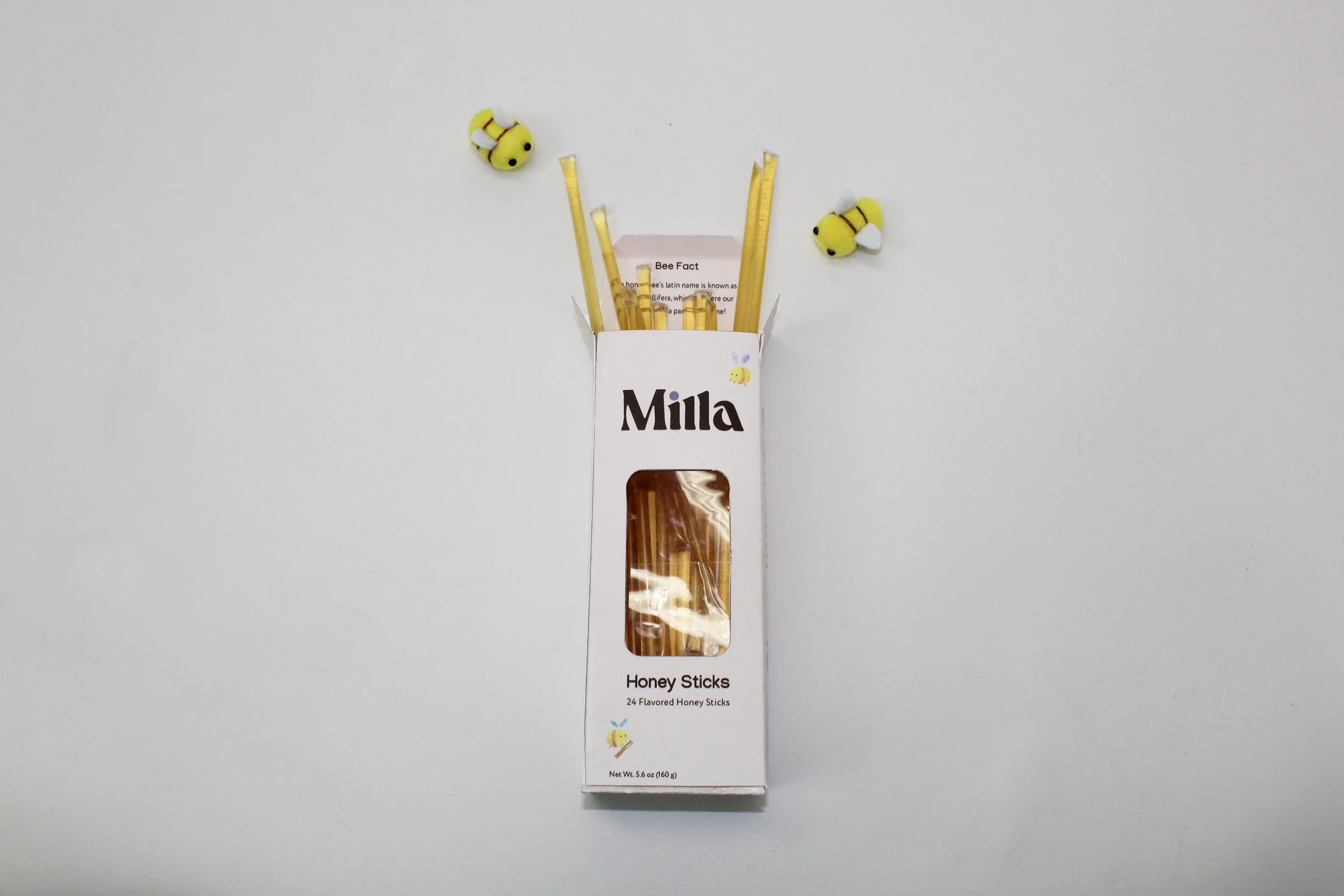
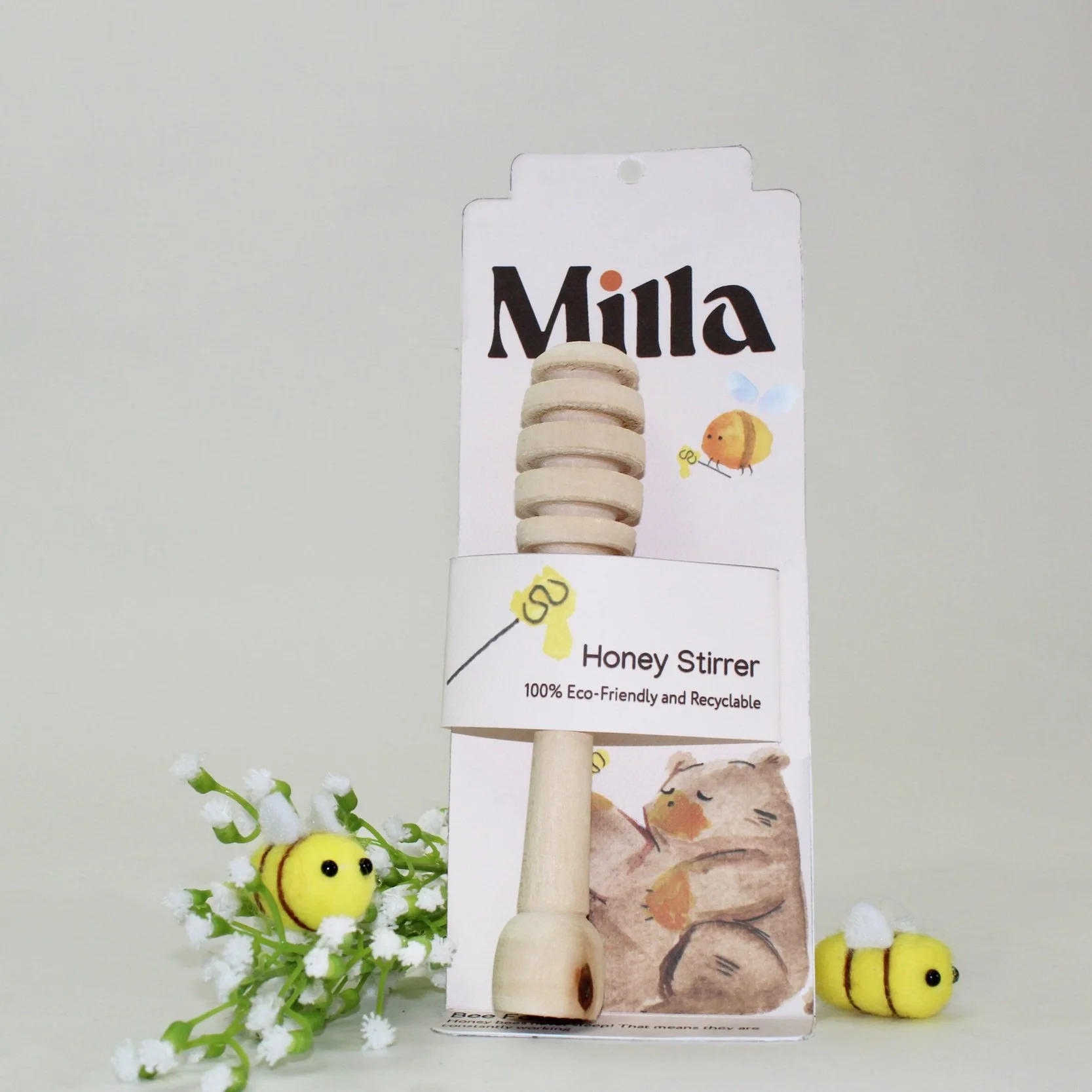
  • Milla is a honey packaging suite that focuses on honey, honey sticks, and honey stirrers! This project called for a packaging suite of three products that all had to relate in one way. This project benefited me in allowing me to continue exploring watercolor illustration and to incorporate them into my design work. I also got to carve the honey stirrer which was extremely rewarding!

  • Best of Show - Auburn Student Juried Show 2023

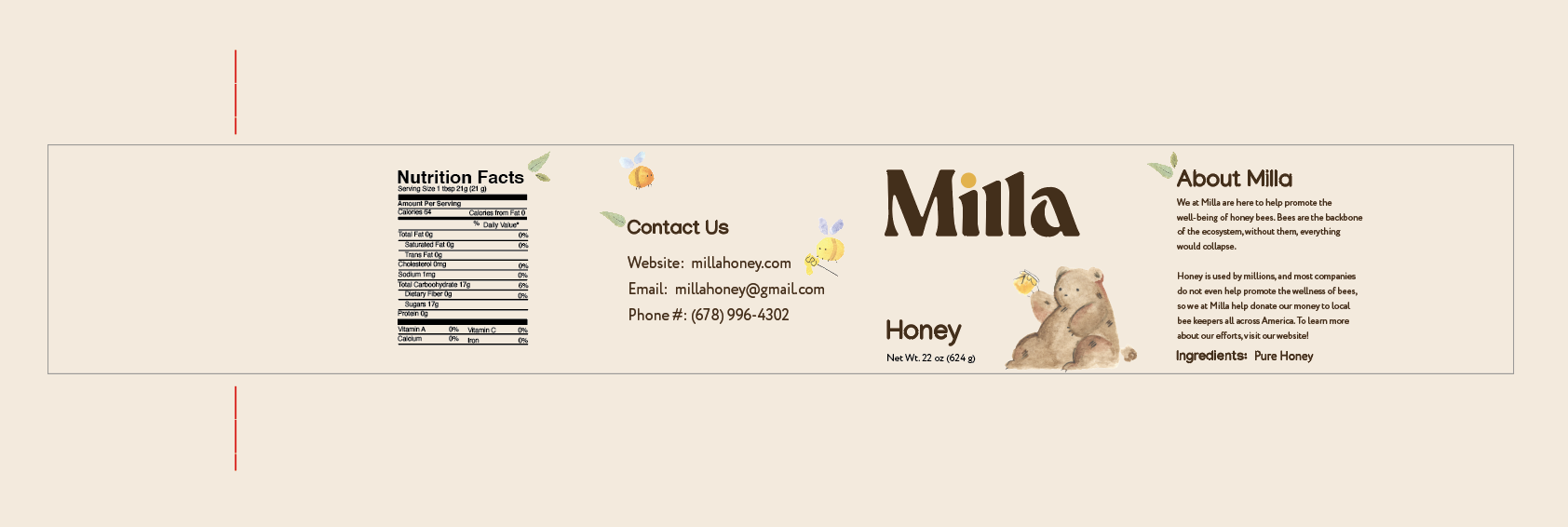
We at Milla want to help promote the well-being of bees. Bees are the backbone of the ecosystem, without them, everything would collapse. Honey is used by millions, and most companies do not even help promote the wellness of bees, so we at Milla help donate our money to local beekeepers all across America.

Case Study

Moodboard and Brief Research

When researching honey branding, I knew I wanted to draw more emphasis on the honey bee since I wanted the reasoning for this brand to promote bee growth and conservation. I came upon the word “Mella,” which means honey bee in Latin. Replacing the e with an i was to utilize the tittle to differentiate what products are being offered in a subtle way.

Rough Sketches

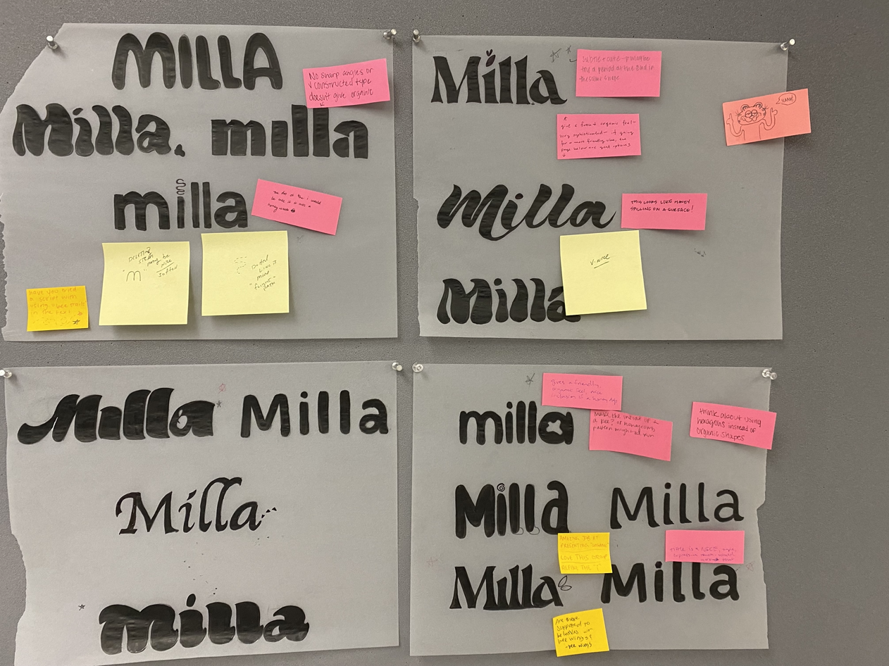
Drawing inspiration from my mood boards and research, I found some typefaces that stuck out with me and did some minor alterations to the type to make Milla more personal. The direction of choosing my typefaces came trying to find something that felt more organic and had the potential for successful change. Pictured are the notes my classmates left on what their favorite directions were.

Digital Sketches

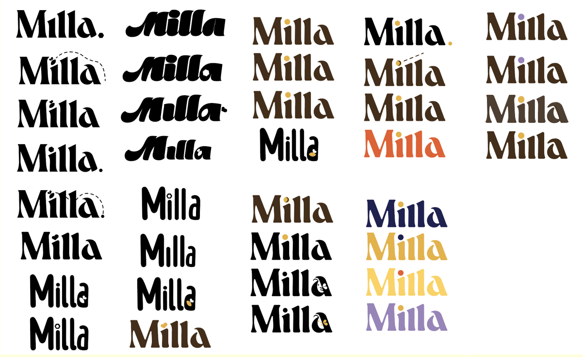
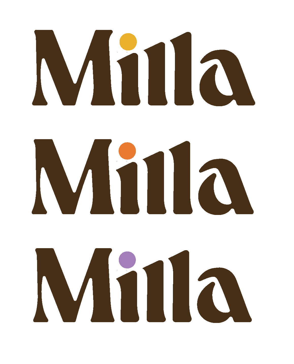
Moving to illustrator, I played around with the L’s, the I, and the A of my typeface of choice, Dahila. In my logo’s final iteration, I thickened the legs of the characters, scaled the I and the L’s to mimic the stripes of a honey bee, and curved the A more inward. The tittle changes color based on the type of content provided in the packaging; a subtle yet noticeable change that doesn’t take away focus from the overall mark.

Box Dummies and Sketches

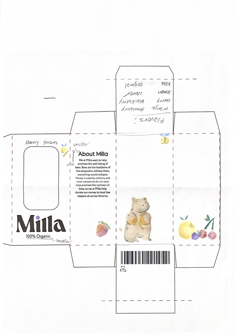
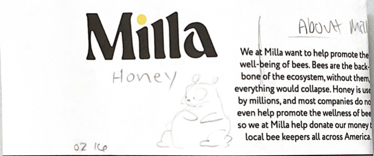
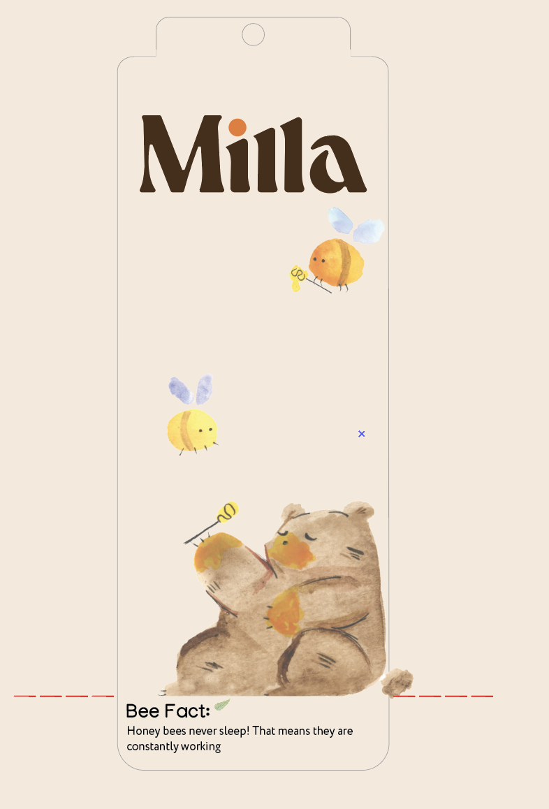
After finalizing Milla’s logo, I moved onto the dummy boxes and sketches. I came up with three different iterations, but ended up combining the left and middle sketches for the final product. My sketches from images one and two also inspired the creative direction for my watercolor illustrations.

Watercolor Imagery

An excuse for me to pull out my watercolors, I hand painted all of the illustrations used on the packaging to really give the feeling of “all natural.” Not every illustration was used, but that’s all a part of the process! P.S., if you look in the corner of the page, you can see the first ever sketch of my current logo!

Rough Dielines

At this point, I had all of the tools to create Milla, it was just a matter of finding the right solution. After a lot of trial and error, and a lot of feedback from my classmates and professor, I was able to create the final dielines that are seen below.

Final Dielines

Logo Iterations

Colors

CMYK  54 65 78 39

CMYK  2 26 88 3

CMYK  37 47 1 0

CMYK  1 56 82 2

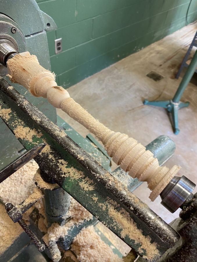
Carving

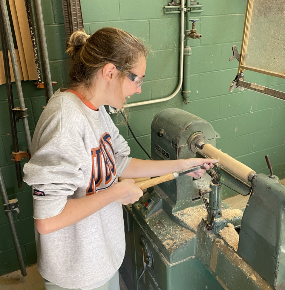
For optimal photos, I was on a mission to find the perfect honey stirrer. However, I could not find a honey stirrer that was the correct size to fit my dielines. So, I reached out to my industrial design friend, Abby, to see how difficult carving a block of wood would be. This process taught me how to use the lathe, a very intimidating form of wood carving. Wood carving my own wood stirrer allowed me to make creative decisions that would impact my overall design; strengthening my project further. Plus, it was really fun to try something out of my comfort zone.

Previous
Previous

Sprout

Next
Next

Goldmind Promotion